影片說明
Logo The Chase terasa seperti simbol utama dan fondasi identitas.
Logo Butterflies terlihat lebih ringan dan lembut, dengan bentuk sayap kupu-kupu, dengan vibe dreamy.
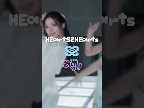
Logo STYLE punya kesan lebih tajam, rapi, dan chic, modern, fashionable.
Logo Pretty Please memberi nuansa yang manis, lembut, dan playful.
Logo FOCUS terasa lebih terarah dan intens.
Sementara logo RUDE! jadi yang paling bold, bebas, dan ekspresif.
Salut banget buat creative team Hearts2Hearts di Center 2 (Prism Production), SM Entertainment. Sistem “Center” ini sendiri merupakan bagian dari strategi SM 3.0, di mana artis-artis SM dibagi ke beberapa production center agar proses kreatif dan manajemennya bisa berjalan lebih fokus, mandiri, dan punya identitas yang lebih kuat. Dan itu benar-benar terasa di Hearts2Hearts, karena tiap logo mereka nggak cuma cantik secara visual, tapi juga selaras dengan mood dan karakter setiap lagu.
The The Chase logo feels like the main symbol and the foundation of Hearts2Hearts’ identity.
The Butterflies logo looks lighter and softer, with butterfly-wing shapes and a dreamy vibe.
The STYLE logo gives off a sharper, cleaner, and more chic impression, feeling modern and fashionable.
The Pretty Please logo brings a sweet, soft, and playful mood.
The FOCUS logo feels more direct and intense.
Meanwhile, the RUDE! logo is the boldest, freest, and most expressive one.
Big appreciation to the Hearts2Hearts creative team at Center 2 (Prism Production), SM Entertainment. This “Center” system is part of SM 3.0, where SM artists are divided into several production centers so the creative process and management can be more focused, independent, and have a stronger identity. And you can really feel that in Hearts2Hearts, because each of their logos is not only visually beautiful, but also perfectly matches the mood and character of each song.
Fan edit & moments of Hearts2Hearts ❤️
Subscribe for more Hearts2Hearts content.
#Hearts2Hearts #H2H #LogoConcept #TheChase #Butterflies #STYLE #PrettyPlease #FOCUS #RUDE #KpopShorts